A fully responsive eCommerce website redesign for Manpriya B, including image direction.
Experience the full site here.
An app that connects customers in need with experts in home repair, backed and funded by the CEO of HomeServe. The task was to differentiate an offering for what is such a traditional set of services, plumbing, gas and heating specialist. What exactly was it that makes this platform different, what do they stand for and why should users care?
The answer was in fact right in front of us - do exactly what everyone else isn’t. The wants and needs of each customer began to form the basis of our thinking. ‘Making life simple’ - this became the core of the brand, it became the point of difference and a constant reminder of why the business exists.
The first person you want to speak to in a moment of need. Someone you could rely on to solve a practical problem in your home. Someone who always keeps their eye out for you. On hand whenever you need them. Someone whom you trust implicitly... DAD. It’s nifty acronym is Done And Dusted.
With ‘Making Life Simple’ as our brand core we used this strategy to drive many decisions about the visual direction as well as the service, from bespoke illustrations to the choice of typefaces, we wanted to bring about a human aspect to what could have become considered a faceless service when digitised.
The simplicity carried through the identity from the wordmark and icon to the illustration style and the tone of voice. We’re people talking to people and that matters.
With a group of incredibly knowledgeable experts ready to start helping customers we developed the app interface to make the beta phase launch.
All aspects of the brand were developed, ensuring we’d not missed a single customer touch-point, from the logo to the technicians uniforms, even detailing the technician’s scent and their newly designed steel cap boots with brand colour laces.
The logo reflected the concept that DAD was your home guardian, with connotations of a halo and the conversational speech bubble. The logotype went through many iterations in order to achieve a considered, bold marque.
The initial technician profile shots were art directed to avoid the stereotypical ‘plumber with a wrench’ image. The lighting and angle allowed them to appear almost heroic but in a softer, friendly and approachable way.
Brand icons and illustrations were developed to reflect the simple and human brand character. All of the design emphasised the making like simple strapline. Strong geometry used throughout gave an engineered feel without being too technical so that we were inclusive.
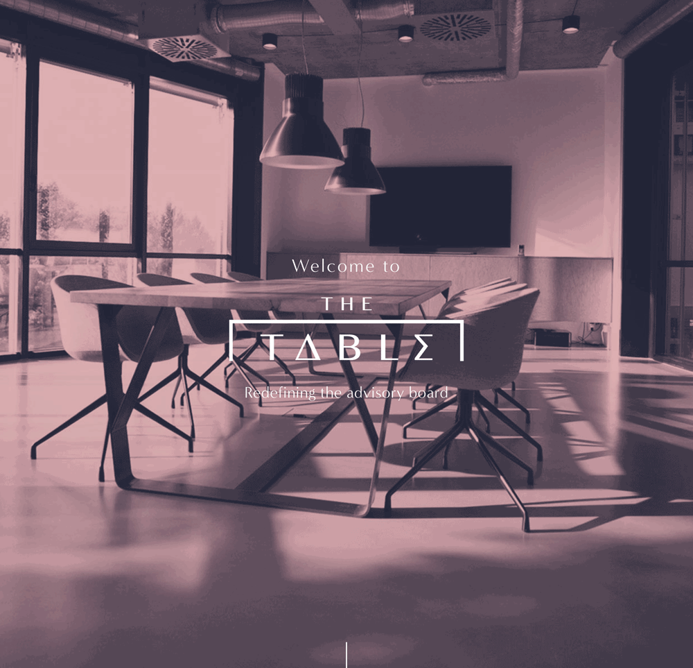
The Table Partnership comprises of talented, successful, verifiable business leaders and experts who have been there, worn the T-shirt and done it many times over.
They provide a unique combination of expertise to align closely with businesses plans across all functional areas in a fresh, easy to understand and efficient model.
I was tasked with developing the brand identity and taking that across an easy to manage Squarespace website, business cards and social media outlets.
Working with Marina and Claudia is inspiring. They’re such a dedicated and passionate pair and the Ink Academy imbues their passion perfectly.
Ink Academy is a bespoke creative writing Course, One-to-one tuition from your own personal editor, completely focused on your writing, your book, fitted around your life, for seasoned and beginner writers alike.
The best possible way to write your best possible book
Built by This is Forge.
Rob Noble, Group of Humans founder came to me with a new concept for a global agency which works with the modern world. No fixed location, a broad collection of talent in multiple disciplines and above, a powerful drive towards taking on and completing projects which are rooted in Humanity.
Our initial conversations began with how to keep the humanity in the brand, but be recognised as industry leaders. Following a branding workshop, hundreds of sketches and several refinements of the brand marque to get it just right, the Humans’ Skull built up of a fingerprint emerged.
An iconic brand marque paired with a custom drawn typographic treatment, teams up with Work Sans, Freight Text Pro and an imagery formula which combines high tech human endeavours with their historic counterparts.
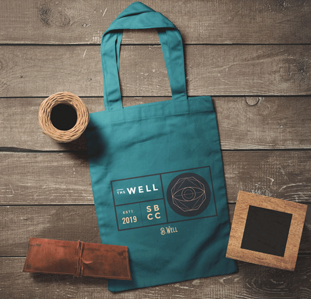
It was an honour to be asked to be a part of the creation of the brand for the new Health & Wellness Center at Santa Barbara’s City College running under the name of The WELL.
Taking into consideration the target audience, it was important that this brand made the students feel connected, important, heard and above all welcome.
Working with the staff to design, build and launch the website and brand and continue to work on promotional literature is a genuine privilege.
Visit the site here.
A new brand created to launch a new surfing product into the market which helps surfers feet to grip to the board.
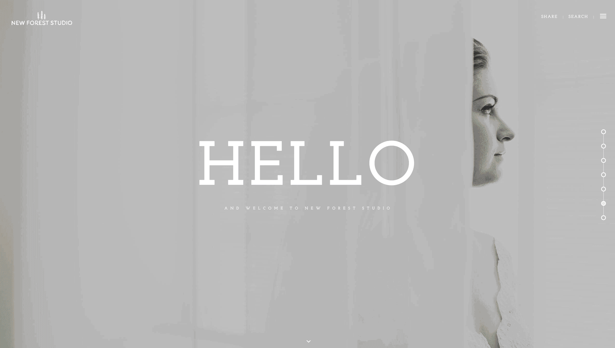
Sam, the man behind the lens of New Forest Studio was an absolute pleasure to work with. Being lucky enough o have used his services, it gave me a fantastic insight into his brand and being able to communicate his story as well as possible.
With so much empathy and texture behind each image, giving the images room to breath was paramount, so making an identity which was chock-full of character, but didn’t demand centre stage made all the difference.
Working up some icons to go with the brand was a fun challenge and led to some great results, you’ll see these icons used as loading icons on the website and popping up here and there across the brand.
Needing a way to both differentiate themselves from DeBeers Forevermark Diamond brand and to reinforce their own brand message to become the leader in diamond jewellery, DeBeers Jewellery briefed us to help steer this bejewelled ship. With such a powerful, deep-seated heritage in diamonds, reducing that sole connotation and enhancing the skill, craft and passion surrounding the DeBeers Jewellery design was a challenging task. The main undertaking was to design a new copy line that would replace their once owned, but now industry general ‘A diamond is forever’ copyline coined by them in 1947.
One immediate realisation whilst working on internal brand workshops was an undeniably rich knowledge about diamonds. We didn’t want to dilute this, but all communications were quite factual which can leave the consumer feeling cold. Buying diamonds, more often than not, signifies an event or feeling. Insight led us to inject the emotion evident internally into the messaging.
The headline of the theme expresses the power instilled in the wearer and the feelings provoked by wearing DeBeers Jewellery, as well as the beauty of the pieces themselves. This plays on the exclusivity of De Beers Jewellery and creates a level of aspiration. Mirroring both the jewellery and the wearer speaks volumes to the buyer and the receiver. It showcases that De Beers Jewellery is the specialist and helps elevate them as the leader in superbly crafted, diamond jewellery.
By developing a creative theme as our guiding statement we were able to develop snippets of the brand story and created messaging for several outputs from internal brand pieces to social media channels such as Instagram and Pinterest.
Constructing a series of modular statements and phrases gave DeBeers a library of concepts to be able to build around. By depicting the emotional aspects that the brand heralds it transformed the messaging from something functional to something readers could identify and develop more of a relationship with. The chosen line will be integrated into DeBeers Jewellery brand language and communications in 2017.
Whilst undertaking the brand audit we noticed that the imagery often felt a little cold and factual. We guided DeBeers Jewellery by art directing best practice for achieving the emotive sentiment that the new brand story hinted at.
We began by auditing which existing imagery was more successful, the imagery shown here is one example of before, cold and often out of context product imagery (on the left), although this imagery showcases the products they were bring used at the wrong touch-points. The more successful images (on the right) had a human and therefore relatable focus, they introduced the beauty of both the wearer and the products, when shot correctly they give an allure and elevated the brand to portray an emotion linked to the event or occasion that diamonds are bought to symbolise.
A complete branding project was undertaken which included a hand-lettered logotype and illustration, website design photographic art direction which is displayed in the brochure.
The hand-lettered style developed for the logotype was continued across the rest of the brand materials and website.
Visit site here.
Working alongside research agency Flamingo the findings of their research became an embodiement of the brand in the form of a 132 page book which presented the information back to PUMA in manageable and understandable sections with strategic propositions interlaced throughout.
spiked is the magazine that wants to change the world as well as report on it. Committed to fighting for humanism, democracy and freedom. spiked was launched in 2001, as Britain’s first online-only current-affairs publication, and is edited by Brendan O’Neill.
And I along with This is Forge were part of the team to make that happen.
Visit Spiked here.
Natalie & Tracey were looking update the look of the business they had built up over the past 12+ years.
After walking into one of the Beautiful World Tents Tipis it was very quickly apparent that the website did not reflect the awe-inspiring experience at all.
After working with the team and understanding the problems they were having with converting viewers into people even attending the open days, the site was completely updated making the experience on mobile as good as the desktop.
Since the redesign, the feedback has been outstanding and the overall maintenance and upkeep of the site is so simple it’s happily shared between the team who are eager to post the latest crop of amazing pics and case studies.
A Think-Tank for a New Era!
A responsive website showcasing the offering, team, thinking, events and research for CIEO.
View site here.
REDEFINING THE BRAND POSITION AND VOICE
Luxury lingerie brand Myla London needed to differentiate from the likes of Agent Provocateur. We worked with the CEO and head of design to clarify their offering and give the brand voice personality and direction. This brand isn’t merely about sex, it’s about an allure and power that’s felt when wearing something so beautifully designed.
After undertaking a full brand immersion, from buying online, being fitted for underwear at both flagship and concessions stores and working internally with the business, we were able to analyse each customer touch point. The importance was to craft the messages and emotions that were relevant at each moment to each audience, ensuring the brand appealed to both male gifters and females purchasing for themselves, not only in the UK but globally.
From here we developed a creative concept that could sit at the heart of the brand, from which we then wrote a brand mission statement and a piece that uncovered the Myla Woman. These pieces worked as powerful tools both internally and externally. The team had clarity on who they were designing for whilst externally it gave the consumer, both old and new, the ability to connect with and aspire to the Myla brand.
Alongside the brand story and tone of voice development we also suggested art direction of photography and a clean up of the visual brand identity hierarchy. One example was addressing the current typography. Equipping Myla with a more formalised grid, which worked across multiple devices and direction on typefaces, gave the brand a more ownable and distinctive character that mirrored the brand story. To show how all of these elements worked together to form one consistent message we redesigned the front-end of the UI across mobile and desktop.
Branding, art direction and fully responsive website design for the luxury resort of Amante Ibiza.
The leading Brain Tumour charity - The Samantha Dickson Brain Tumour Trust tasked us to help them increase their brand recognition and improve general awareness of brain tumours. The charity was started by Samantha Dickson's parents in 1996 after their daughter passed away from a brain tumour. They had grown the charity to turnover £2million a year after spotting a gap in Brain Tumour research. Their work was admirable and extremely successful, yet the charity was unheard of. It was time for a brand refresh in order to grow and push the boundaries of research.
We started by realigning their vision and values, beginning with focus groups both internally and externally. The spectrum covered all audiences, from researchers, receptionists, health-carers, consultants, those diagnosed, their family members and people who had never come into contact with the charity itself or brain tumours. These results formed a set of valuable information reference points that we referred to whilst developing the brand.
Renaming the charity was a fundamental step in its success and getting it right was a mixture of creativity and sensibility. They were the largest dedicated brain tumour charity in the UK, but were unable to see this themselves. We simply reflected this in the new name, The Brain Tumour Charity. It echoed confidence and mirrored the straight forward, focussed approach of the charity’s actions whilst giving them the authority that they so rightly deserved.
Following the brand design strategy, whereby we established the values that need to be reflected as well as the brand essence of ‘Passionately Focussed’, we developed a brand tool-kit. This gave the internal marketing and communications team the verbal and visual structure it had been lacking but also the flexibility to develop and build the brand. The guidelines we produced covered many eventualities and gave direction towards dealing with most situations geared to a variety of audiences.
Alongside the verbal brand delivery was the identity, which covered a multitude of outputs and elements from the confident, bold and assertive logotype to image direction which informed but also gave a sense of hope. To illustrations that ranged from fun fundraising topics to more in-depth medical explanatory diagrams. The objective was to be an approachable brand that didn’t assume too much and put clear, digestible, straightforward and insightful information first.
The identity was taken across all outputs from print, through to digital across a number of channels. Since the re-brand the charity have secured new patrons such as Tom Daley, enabling a huge social media following. This has increased their turnover from £2million to almost £13million and grown from a team of 14 to 80+. The new brand has given them the status and recognition to establish corporate sponsorships that were impossible before.
Designing and illustrating Flamingo’s FYi publication, which consists of a collection of insights from Flamingo’s staff across the globe on current trends surrounding migration.
The output was a printed and bound book as well as a native iPad application, we carried the illustration across onto the iPad and animated small portions of it to further enhance the experience.
Jacob, the owner of Purplebone came with a problem. A great store, but no online presence. Changing this for him and the team across the 3 London stores was great fun!
Working with Juliet was great fun. We worked through streamlining the brand and then taking this design direction across the website.
The site has a 'design my own' section where you're guided through a series of steps to be able to create your own custom piece of jewelry.
A collection of hand drawn pieces for the 2016 Tour De France.